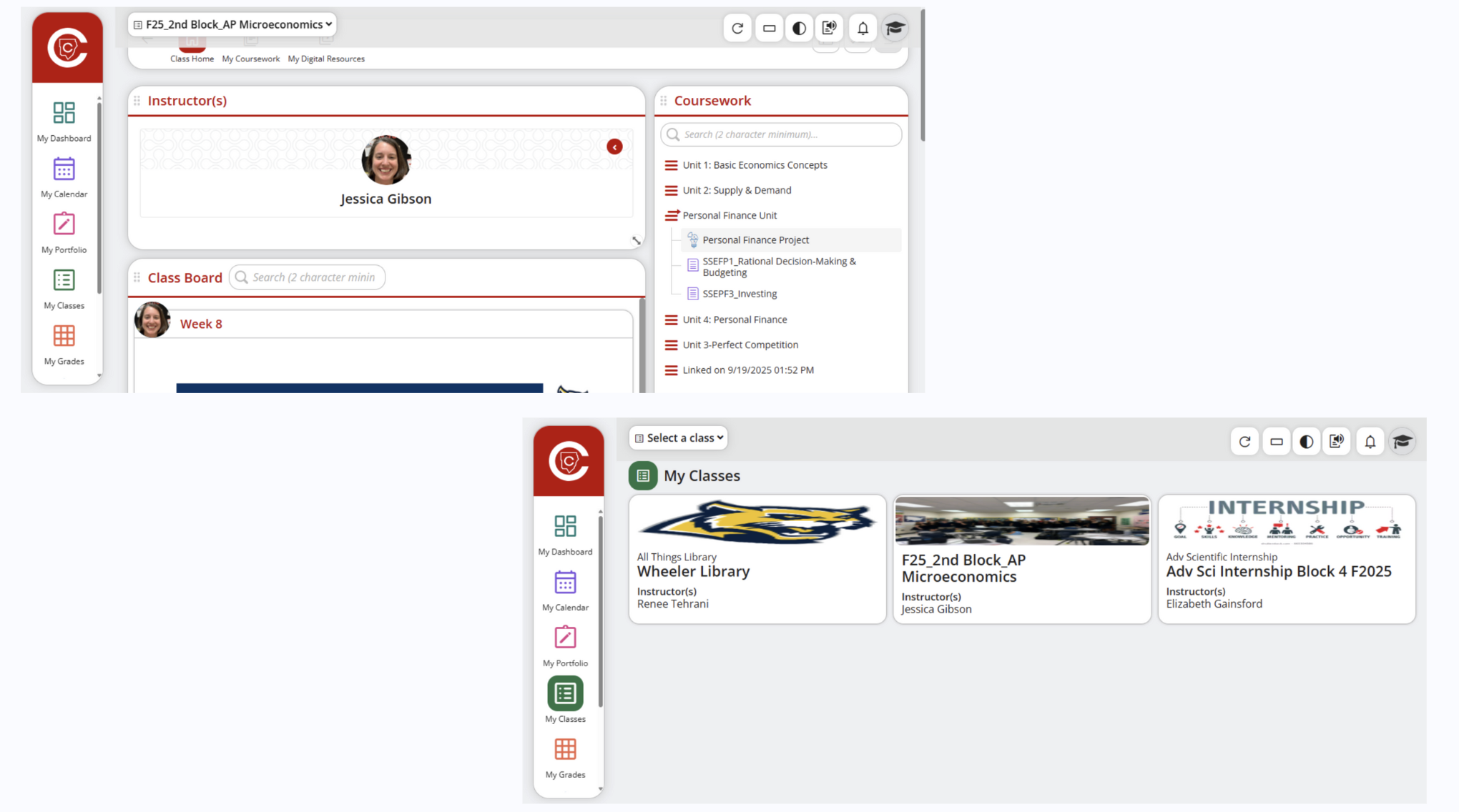
A refresh for Cobb Teaching & Learning System, focusing on improving functionality and ease of use
Overview
CTLS (Cobb Teaching and Learning System) is an education platform used by students and teachers for managing classes, grades, and assignments.
While CTLS serves an important purpose, its interface often felt overwhelming, outdated, and inefficient — especially for students navigating multiple classes each day.
This redesign focuses on making CTLS student-centered, intuitive, and visually modern, using insights from user feedback
Process
Empathize
Define
Ideate
Prototype
Test
Empathize
I personally used CTLS for many semesters, and while this platform serves an important purpose, its interface often felt overwhelming and inefficient
User Research
To better understand user pain points and needs, I conducted a small-scale user research study that included:
A Few Key Questions
- How do you currently use CTLS?
- What frustrates you most about the interface?
- Which tasks are most important or frequent?
- How engaging is CTLS to you?
Key Insights
Insights
- Too many steps to find assignments
- Resources are hard to find
- Hard to distinguish between classes
- Visually outdated
Notes for my design
- Simplify navigation and group related features together
- Organize various resources
- Keep teachers and classes visible persistently on the left
- Modernize the interface
Define
Problem
Students and teachers both rely on CTLS daily, yet the interface made common tasks harder than necessary.
Through firsthand experience and peer feedback, I identified major usability issues:
As a student user, I wanted to design a system that felt clear, motivating, and human-centered.
Ideate
Existing Design

Information Architecture
I decided to restructure CTLS around an efficient user flow
Prototype
User Flow
.png)
Featured Wireframes
.png)


Featured High Fidelity Designs
.png)
Test
After building a high-fidelity prototype, I wanted to validate whether the redesigned navigation made CTLS easier to use and more intuitive for students.
I conducted usability sessions with current high school students using my interactive Figma prototype. Each participant completed key tasks such as finding assignments, checking grades, and switching between classes. I recorded their task completion times, observed navigation behaviors, and recorded their feedback
Performance Improvements
- 60% faster average navigation between selecting a specific class to opening a specific resource
- Task completion rate for finding assignments improved from 80% before
to 100% after
